Utilizing Space to Educate Customers: A Checking Account Usability Study
Disclaimer: This case study uses fictitious data and mock-ups based on a real case study.
What are we looking at?
The goal of this study was to capture user feedback on the rewards checking account interface. Specifically, the team aimed to evaluate users' comprehension and understanding of differing mobile check deposit transaction types and monthly statement availability.
Objectives
Understand mobile check deposit usability and status comprehension
Capture insights about participants’ expectations for available, current, and running balances
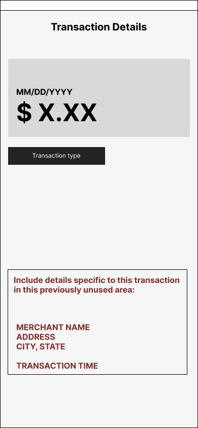
Understand expectations for transaction detail pages
Identify knowledge gaps about participants’ understanding of transaction phases
Testing Activities
We conducted seven remote, moderated interviews with the following structure:
Introduction: participants shared their experiences with other checking account apps and mobile check deposit features
Free Explore & Task-based Test of Prototype: moderator led participants through multiple screens to test usability and understand how users comprehend information given within transaction details and activity screens
Wrap-up: participants shared how this experience compares to their current and/or previous experiences with checking account apps
General Trends, Insights, and Recommendations
Participants have low expectations for a checking app’s visual interface, leaving a lot of room for banks to impress
When sharing their initial reactions to the prototype, most participants said it met their expectations, making statements like "This looks like all of them do" or "All checking accounts look the same"
Meeting expectations is not a bad thing! But it does demonstrate that there is an opportunity to expand user expectations about checking account interfaces
User Interface Expectations
Recommendation: Find ways to visually stand out from competitors checking account apps
People don’t want to do math; they just want to know how much money they can spend right now
Some participants noted that having a running balance would be nice to have to help clarify their balance but would not be necessary
Most participants did not need to know total vs. adjusted balances and found these confusing
Participants viewed a running balance as a nice-to-have, not a need-to-have
Most Important Info: The Balance
Recommendation: Only include the amount they currently have to spend. If including a running balance, include it in unused space beneath each transaction within the transaction list.
The overall design is clean and easy to navigate
Many users liked the app’s simple, clean design, and all participants were able to quickly locate specific transactions during testing
However, participants also felt space was wasted in certain areas of the app
Most participants thought the reverse chronological layout was simple and intuitive
Color coding helped people quickly understand which transactions had gone through
Overall Design and Navigation
Recommendation: Utilize some of the wasted space by including key information users need, such as merchant details and running balance, if including
There are large gaps in users’ comprehension of pending, processing, and posted transactions, deposits, and withdrawals
Banking terms such as ACH outgoing collections and payments and pending/processing transactions caused confusion in some participants, potentially due to existing mental models combined with lack of clarity within the app
Participants wanted to see clarifying information built into the transaction detail screens
Banking Terminology
Recommendation: Include basic definitions of terminology within the transaction detail screens to help users understand their current balance
Participants are eager for more information, and there is room within transaction detail screens to provide it
Some participants wanted more details to ensure the transaction was legitimate, such as an address where the transaction was completed
Participants noticed details such as transaction number and local currency conversion, but had mixed feelings regarding the utility of this information
Space for More
Recommendation: Users want information that knows their money is being spent safely in addition to banking terminology definitions. Include merchant information to provide clarity on transaction detail screens.